How to Use Mobile Responsive Testing Tools for Websites in 2026

Riten Debnath
05 Aug, 2025

Are you frustrated when your website looks perfect on your laptop but turns into a mess on your phone? In 2026, mobile users make up the majority of web traffic, and if your site isn’t mobile-friendly, you’re losing visitors, customers, and credibility every single day. Responsive web design isn’t just a nice-to-have it’s a must for any business that wants to grow online.
I’m Riten, founder of Fueler, a platform that helps companies hire through assignment by letting professionals showcase their real work. In this article, I’ll show you how to use the latest mobile responsive testing tools to make sure your website looks and works great on every device. Just like a strong portfolio proves your skills and builds trust, a mobile-optimized site is your shortcut to a better user experience and higher search rankings.
Why Mobile Responsive Testing Matters in 2026
Mobile responsive testing is the process of checking how your website appears and functions on different devices and screen sizes. With so many people browsing on smartphones and tablets, a site that isn’t responsive can lead to lost sales, poor SEO, and frustrated users. Testing helps you catch layout issues, broken buttons, and slow load times before your visitors do.
- Ensures your site looks professional on all devices
- Improves user experience and keeps visitors engaged
- Boosts SEO rankings, as Google prioritizes mobile-friendly sites
- Reduces bounce rates and increases conversions
What Are Mobile Responsive Testing Tools?
Mobile responsive testing tools are software or online services that let you preview and test your website on different devices and screen sizes—all without needing a room full of phones and tablets. Automated testing can save time by running these checks repeatedly without manual effort. These tools help you spot problems quickly, so you can fix them before your users notice. They’re a must-have for web developers, designers, and anyone serious about delivering a great online experience.
- Simulate dozens of devices and screen sizes instantly
- Check for layout issues, font sizes, and image scaling
- Test interactive elements like menus and forms
- Some tools offer real device testing for extra accuracy
Why it matters: Using these tools saves time and ensures your website looks and works perfectly for every visitor, no matter what device they use.
Top Mobile Responsive Testing Tools in 2026
With so many options available, choosing the right tool can be overwhelming. Here are the most reliable and up-to-date mobile responsive testing tools for 2026, each offering unique features to help you deliver a flawless mobile experience.
1. BrowserStack
BrowserStack is one of the most popular choices for real device testing. It lets you test your website on hundreds of real smartphones and tablets, not just emulators. You can interact with your site as if you were holding the device in your hand, checking for layout, speed, and touch responsiveness.
- Access to real devices for accurate testing
- Supports automated and manual testing
- Integrates with popular development tools
- Quick setup with no downloads required
Pricing: Starts from $39/month for individual plans
Why it matters: BrowserStack helps you catch real-world issues that emulators might miss, ensuring your site delivers a top-notch experience on every device.
2. Google Mobile-Friendly Test
Google’s Mobile-Friendly Test is a free, easy-to-use tool that checks if your website meets Google’s mobile standards. Just enter your URL, and it will highlight any issues with layout, text size, or clickable elements. It’s perfect for quick checks and SEO optimization.
- Instant feedback on mobile usability
- Highlights specific issues to fix
- Directly linked to Google’s search ranking criteria
- Completely free to use
Why it matters: This tool helps you stay in Google’s good books, which can boost your search rankings and bring more organic traffic to your site.
3. Responsinator
Responsinator is a simple online tool that shows how your website looks on different popular devices. Just type in your site’s URL, and you’ll see previews for iPhones, Androids, tablets, and more. It’s great for quick visual checks and spotting obvious layout problems.
- Easy-to-use interface for fast results
- Previews for multiple popular devices
- No account or download needed
- Free for basic use
Why it matters: Responsinator makes it easy to catch design issues early, saving you time and helping you deliver a better mobile experience.
4. LambdaTest
LambdaTest offers both live and automated testing across a wide range of browsers and devices. It’s designed for teams who need to collaborate on testing and debugging. With features like screenshots, video recording, and bug tracking, it’s a powerful tool for serious developers.
- Live and automated testing on real devices
- Collaboration tools for teams
- Screenshots, video logs, and bug reporting
- Integrates with project management platforms
Pricing: Starts from $19/month
Why it matters: LambdaTest helps teams work together to catch and fix mobile issues quickly, making it perfect for agencies and larger projects.
5. LT Browser
LT Browser is a specialized tool from LambdaTest focused on building and testing responsive web designs. It allows you to create custom device profiles, test side-by-side views, and debug issues in real time.
- Custom device profiles and resolutions
- Side-by-side comparison of different devices
- Built-in debugging tools
- Free and paid versions available
Why it matters: LT Browser streamlines the process of designing and testing for mobile, helping you spot and fix issues before your site goes live.
How to Use Mobile Responsive Testing Tools Effectively
Simply having the right tool isn’t enough—you need to use it the right way. Start by testing your site on the most common devices your audience uses. Check for layout issues, slow loading times, and broken buttons. Don’t forget to test interactive elements like forms, menus, and sliders. Review your site in both portrait and landscape modes, and use the tool’s built-in bug reporting to keep track of what needs fixing.
- Test on multiple devices and screen sizes
- Focus on key user journeys like sign-up or checkout
- Check for touch responsiveness and clickable areas
- Use screenshots and reports to communicate issues with your team
Why it matters: Thorough testing helps you catch problems before your users do, ensuring a smooth, frustration-free experience for everyone who visits your site.
Common Issues Found During Mobile Testing
Even the best websites can have mobile issues. Some of the most common problems include text that’s too small to read, buttons that are too close together, images that don’t scale properly, and menus that don’t work on touch screens. Slow load times and missing content are also frequent headaches.
- Small or unreadable text on mobile screens
- Overlapping or hidden elements
- Slow loading images or scripts
- Broken navigation menus
Why it matters: Fixing these issues keeps users happy, reduces bounce rates, and helps your site perform better in search engines.
Integrating Responsive Testing into Your Workflow
The best web teams make mobile testing a regular part of their process, not just a last-minute check. Use responsive testing tools as you design, build, and update your site. Set up automated tests to catch new issues as soon as they appear. Share results with your team and make mobile-friendliness a priority from day one.
- Test early and often during development
- Automate tests to save time and catch issues fast
- Share bug reports and screenshots with your team
- Make mobile optimization a key project goal
Why it matters: Integrating testing into your workflow ensures your site stays mobile-friendly, even as you add new features or content.
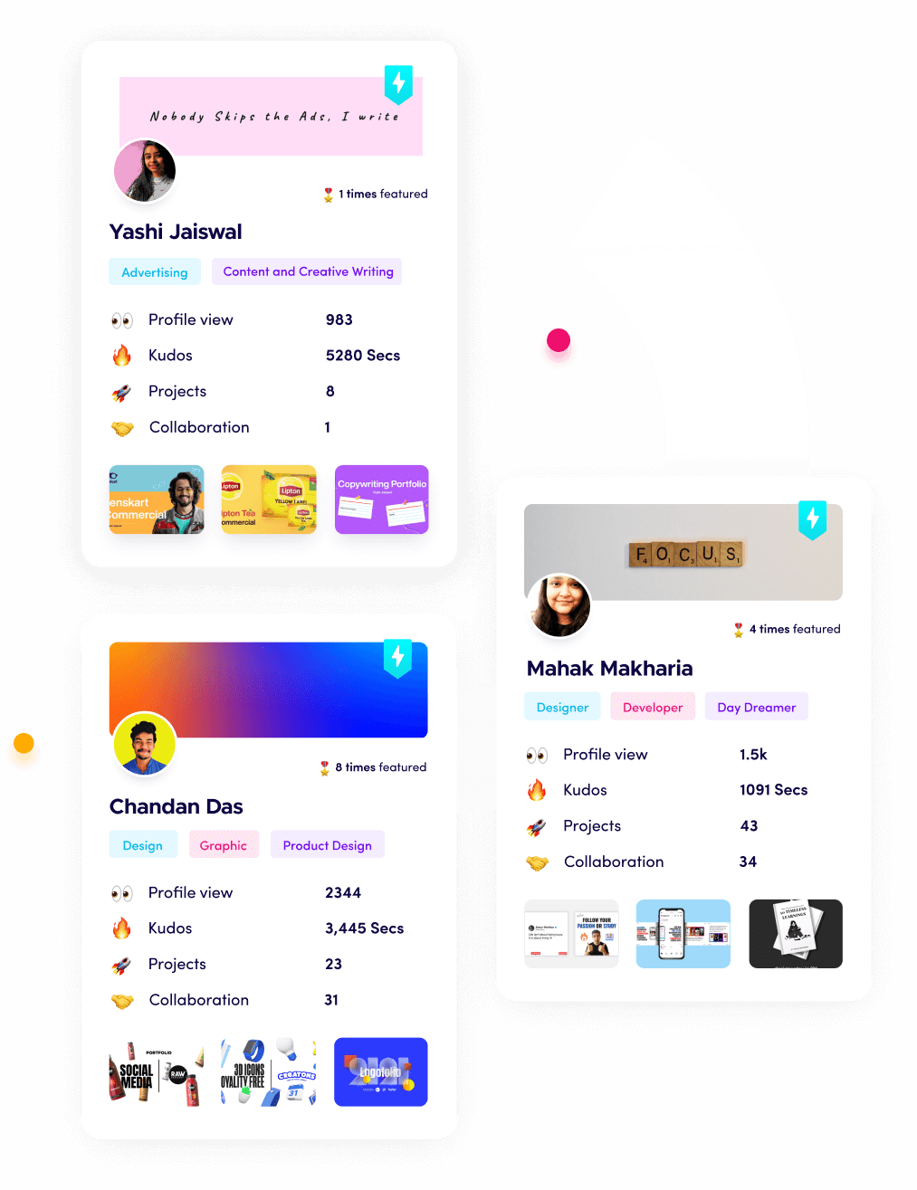
Fueler: Showcasing Your Mobile Testing Projects
If you’re a web developer, designer, or QA specialist, showcasing your mobile testing projects on Fueler can help you stand out. Fueler lets you create a portfolio of real assignments, making it easier for companies to see your expertise and hire you through assignment-based recruitment.
Final Thought
In 2026, mobile responsive testing is not just a technical step—it’s a business essential. By using the right tools and making testing a core part of your workflow, you can deliver websites that look great and work perfectly on every device. This keeps users happy, boosts your search rankings, and helps your business grow in a mobile-first world.
FAQs
1. What is a mobile responsive testing tool?
A mobile responsive testing tool lets you see how your website looks and works on different devices and screen sizes, helping you find and fix problems before users notice.
2. Why is mobile responsive testing important for websites in 2026?
Most people browse the web on phones or tablets, so testing ensures your site is user-friendly, loads quickly, and ranks well on search engines.
3. Which is the best free mobile responsive testing tool?
Google’s Mobile-Friendly Test is a great free option for quick checks, while Responsinator offers easy previews for multiple devices.
4. Can I test my website on real devices without buying them?
Yes, tools like BrowserStack and LambdaTest let you test your site on real devices online, so you don’t need to own every phone or tablet.
5. How can I show my mobile testing skills to get hired?
Build a portfolio on Fueler with examples of your mobile testing work, including screenshots, reports, and before-and-after results to prove your expertise.
What is Fueler Portfolio?
Fueler is a career portfolio platform that helps companies find the best talents for their organization based on their proof of work.
You can create your portfolio on Fueler, thousands of freelancers around the world use Fueler to create their professional-looking portfolios and become financially independent. Discover inspiration for your portfolio
Sign up for free on Fueler or get in touch to learn more.

What should you do next?
You've read the article. Now turn your skills into proof of work and unlock more opportunities.
Build your proof of work portfolio
Create a clean portfolio with projects, assignments, resumes, and AI stack details that companies actually want to see.
Create your Fueler portfolio →Apply through assignments, not resumes
Stand out by solving real tasks from companies hiring on Fueler.
Explore assignments →Get discovered by companies
Make your work public and let recruiters discover your skills through actual projects instead of keywords.
Get discovered →