How to Design a Thumbnail for Fueler Profile?

Team Fueler
14 Dec, 2023
While uploading your proof of work, did you struggle to create an appealing thumbnail for your fueler profile? There are 80% chances you have. (add some valid date number, it gets attention)
In this blog, we will discuss Proof of Work thumbnails in detail. Let’s learn the art of creating stellar thumbnails for your Fueler profile that make people click on your projects.
Why add a Thumbnail in the first place?
Courtesy: Project on Fueler.io by Yasin Alyani
To get traction on your project, a thumbnail is one of the most crucial elements to consider.
First impression is the last impression!
Without an attractive thumbnail your ideal client will not click open your proof of work and your hours of hardwork will be resting under dust! .
Now that we have understood how vital a thumbnail, we must understand where it can be seen!
Your POW thumbnail can be on various places like -
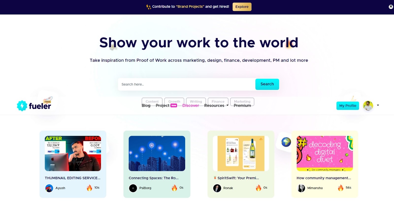
- The Discover page.
Every new fueler project lands here, and your thumbnails start to compete with every new Proof of work that’s uploaded. (Screenshot of Discover page)
Courtesy:Fueler Website Screenshot
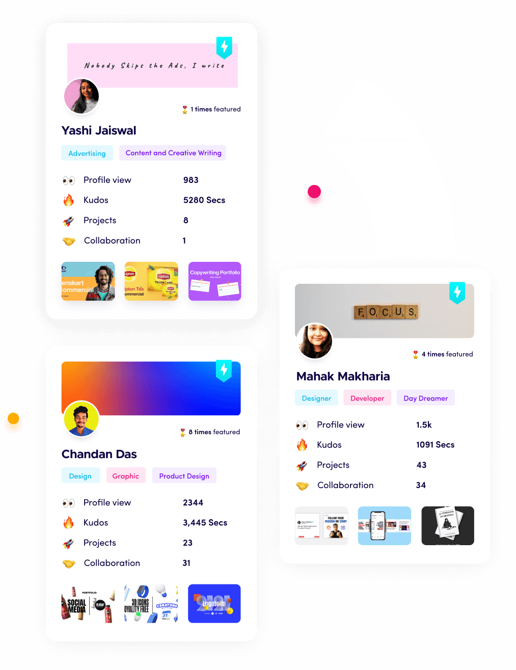
- Your profile.
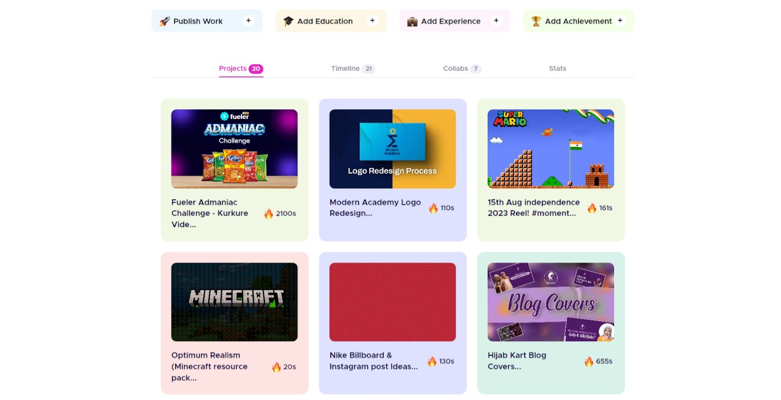
Courtesy: Fueler Website Screenshot
A Fueler profile has four sections.
- Projects: Every project that you upload is going to be visible here.
- Timeline: All projects that you upload are going to be visible here as well, but it will be sorted by the date, along with other metrics.
- Collabs: All your projects with the collaborator's account added end up here.
- Stats: This page contains thumbnails of 4 of your projects.
- Three project thumbnails added here are random, but the 4th one depends on the project's views. Your most viewed project ends up here.
You must remember that what you upload will be seen, so you should design accordingly.
Before you start designing, you will have to make a canvas for designing. A Fueler thumbnail dimension is 1500x1000px.
A rookie mistake in a thumbnail is not having breathing space near the borders. You would have noticed that thumbnails get soft corners after uploading to Fueler, which gives a perfect look. Not having breathing space near borders results in your content on the thumbnail to get cropped..
Safe Area:
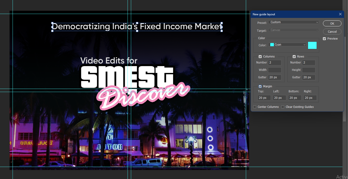
Courtesy: A thumbnail which I just created which I will never use
Usually, it depends on different software on how the margin is activated, but for example, in Photoshop, you go to View > New Guides layout > Margins.
Keeping a 40px Margin is preferred.
This helps safeguard your essential aspects of texts and composition in a safe area, and your thumbnail looks Clean and attention-grabbing.
Also guides help you align your elements and images which helps in creating a better composition.
What colours can you use?
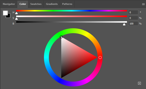
Courtesy: ScreenShot of Color Panel from Photoshop
- You can use colour from the display picture or the banner you have used on your Fueler profile.
- You can use brand colours specified by the brands themselves.
- You can also choose some colours from websites like -
Color wheel, a color palette generator | Adobe Color
Color Palettes for Designers and Artists - Color Hunt
Coolors - The super fast color palettes generator!
Or search for a premade palette; if your brand is a travelling based brand, you can search travelling color pallete - Search (bing.com)
Elements
It's subjective and varies depending on your proof of work/project.
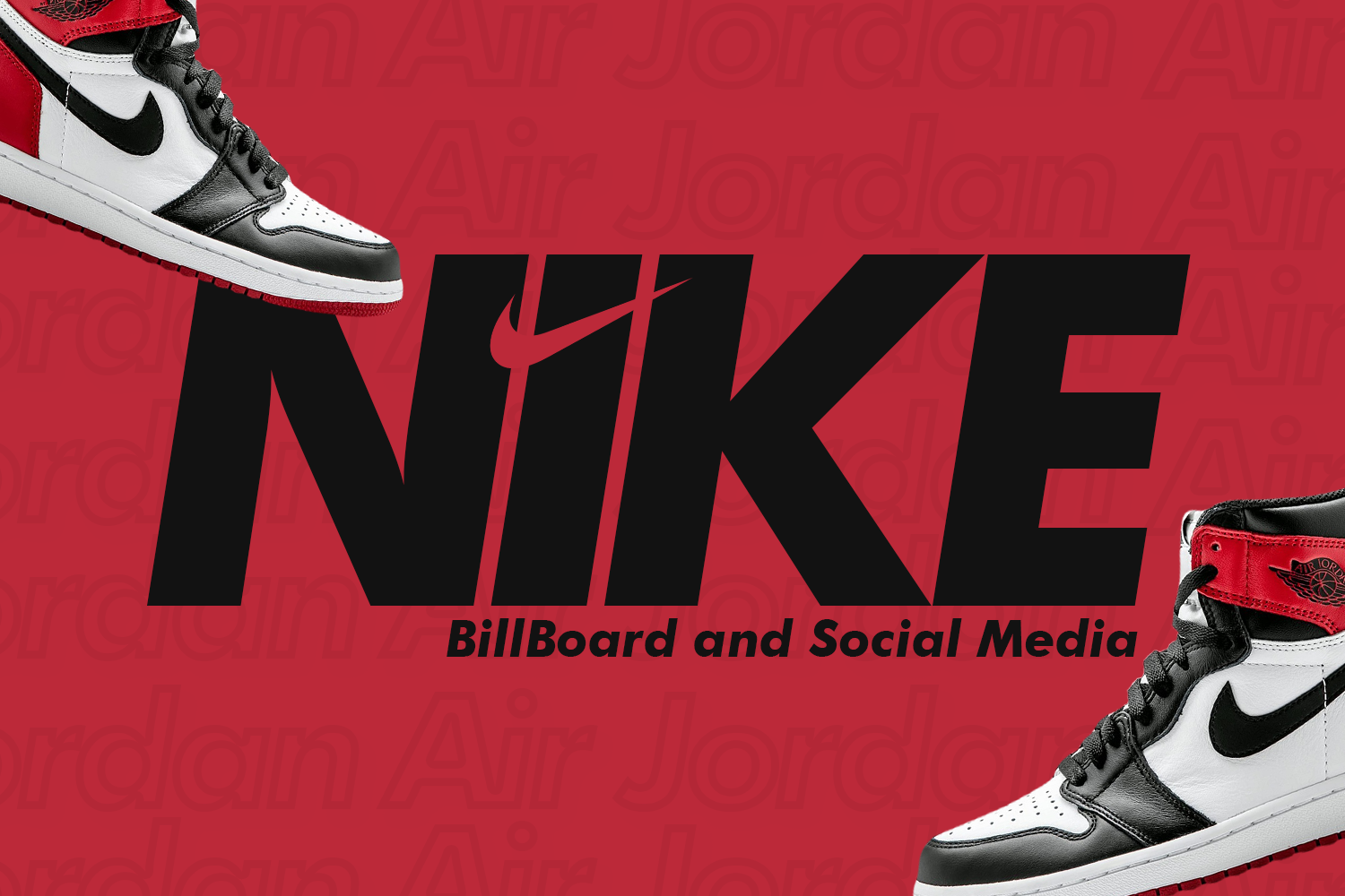
You can add images and icons based on your brand. For example, if your brand is based on bamboo, you can add bamboo or bamboo products or icons/illustrations related to bamboo or nature.
Font choices?
Same as you did with colours, you can choose from the brand’s font that is used. You can find that on their website by pressing F12, and you can find what fonts and colours are used with what line spacing and kerning.
Or
Here are some font suggestions that almost work everywhere - Poppins & Helvetica.
Pro Tip from the founder himself (Riten Debnath on Fueler.io) -
“While making your Proof of Work thumbnail, make sure to add the brand's logo so if the viewer or the decision maker is familiar with the brand, it will get his attention and it creates an impact

Optional tip -
You can colour-code your thumbnails for a specific niche of your work.
You can have all the Graphic designing POW Thumbnails in some specific colour and all your video editing POW in a different specific colour. You can do this depending on your niche.
Some don’t: Not choosing pre-installed fonts because they are overused, for example, Times New Roman or Impact or some handwritten font that is barely legible
Now it's time to apply all these tips to your project, so start creating on a blank canvas or use our Free Templates.
What should you do next?
You've read the article. Now turn your skills into proof of work and unlock more opportunities.
Build your proof of work portfolio
Create a clean portfolio with projects, assignments, resumes, and AI stack details that companies actually want to see.
Create your Fueler portfolio →Apply through assignments, not resumes
Stand out by solving real tasks from companies hiring on Fueler.
Explore assignments →Get discovered by companies
Make your work public and let recruiters discover your skills through actual projects instead of keywords.
Get discovered →