10 High-Converting Landing Page Examples for US Startups

Riten Debnath
30 Aug, 2025
There’s a reason high-growth startups invest heavily in landing page design: it’s the frontline of conversions. In today’s hyper-competitive US startup ecosystem, a compelling landing page can make or break your customer acquisition. This guide pulls back the curtain on the top-performing landing pages in 2025 (with actionable details to apply now), so you can boost signups, demos, or sales and scale faster.
I’m Riten, founder of Fueler, a portfolio platform empowering startups and professionals to get hired through real work samples. In this article, I’ve spotlighted the most inspiring, practical landing page examples you can learn from this year. But remember, it’s not just about design trends; what matters most is how you showcase your results and value clearly. Your landing page is the digital handshake that builds credibility and trust instantly for your visitors.
1. Stripe – Concise Value Propositions That Convert
Stripe’s home and feature pages are a masterclass in clear messaging and conversion focus. Each section addresses the core pain points of their audiences (startups, developers, finance leaders) with snappy, benefit-driven headlines. Clean layouts and minimal distraction keep every CTA in view.
- Headline-focused layout with subtext that answers “why Stripe?”
- Strong visual hierarchy (large fonts, whitespace)
- Social proof from top brands and security assurances
- Seamless, persistent signup CTA
Why it matters: Straightforward language and white space boost conversions. For US startups aiming to quickly communicate trust and value, Stripe’s clarity ensures potential customers stick around and take action.
2. Webflow – Engaging Product Demos and Real User Stories
Webflow’s landing pages leverage animated product previews and real customer stories to deliver information swiftly. It isn’t just feature-heavy—it’s visually interactive and proof-driven, showing exactly how the product works in a few seconds.
- Autoplay product GIFs, “See it in action” approach
- Immediate validation via logos and testimonials
- Actionable CTAs above and below the fold
- Smart use of badges like “Editor’s Choice” for trust
Why it matters: Startups need to reduce friction and skepticism for new users. Showing exactly how your product works (and who is succeeding with it) can skyrocket demo requests and user signups.
3. Notion – Customization Paths for Segmented Audiences
Notion’s landing page quickly personalizes the experience for startups, enterprises, and individuals. The visitor can select their persona, and the page dynamically shifts content and CTAs for their specific journey.
- “Who are you?” selector for role-based content
- Focused testimonials and feature lists per use case
- Minimalist design with modular building blocks
- Direct calendar integration for a product tour
Why it matters: Startups serving multiple customer profiles can double their conversion rates by offering paths tailored to specific segments. This clarity shortens the time from interest to action.
4. Airbase – Data-Driven Trust and Instant Demo Booking
Airbase’s B2B landing pages lean on numerical proof (“$800B managed,” “Fortune 50 clients”) and make it frictionless to book a live demo in under 30 seconds, using embedded forms and calendar links.
- Highlighted customer metrics and ROI stats
- Animated product screenshots for transparency
- Calendar booking widgets, not just contact forms
- Trust badges from top tech finance analysts
Why it matters: For financial and B2B SaaS startups, hard data and proof are essential. Airbase’s approach ensures that busy executives get what they need fast relevant for all mission-critical startup products.
5. Ramp – One-Page Design With Instant Pricing Calculator
Ramp’s landing pages are succinct, with a value calculator built right into the hero section. Visitors instantly see potential savings, driving action and reducing doubts.
- Hero area includes a cost savings calculator
- 1-min explainers and strong positioning statements
- Easy pricing tables and CTA for instant signup
- Centralized FAQ to pre-empt objections
Why it matters: Interactive value delivery keeps users engaged and makes your proposition tangible. Startups can capture and convert prospects much faster using this approach.
6. Loom – Visual Product-First, Fast CTA Flow
Loom displays its product in action immediately as you land. With clear “Get Loom Free” above the fold, it minimizes choices (and friction), showing real results (like time saved in comms) mid-page.
- Video at the top for instant context
- Social proof and numbers throughout
- Quick form or Google OAuth signup path
- Real startup use cases, not just generic testimonials
Why it matters: For video or product-led startups, showing the experience and reducing steps to try delivers massive gains in trial and conversion rates.
7. Deel – Global Trust Signals and Contextual CTAs
Deel’s international payroll landing targets US companies hiring worldwide. It features jurisdiction badges, “used by 20,000+ teams” stats, and an always-on live chat bot for instant questions.
- Security compliance badges (SOC 2, GDPR, etc.)
- Rolodex of top client logos
- “See Pricing,” “Talk to a Specialist,” and demo CTAs
- Globally current, localized language per visitor’s country
Why it matters: If your startup serves regulated clients or cross-border markets, trust icons and hyper-relevant CTAs reassure and convert international customers.
8. Zapier – Outcome-Oriented Headlines and Use Cases
Zapier makes sure every visitor knows its benefits without jargon. Pages open with “Automate your work” and use customer success snippets for every major vertical. Each integration is paired with a clear outcome and real workflow screenshot.
- Headline with direct results, not just product claims
- Use case tiles for top startup tools
- Predictive search for integrations or templates
- Instantly accessible resources (no gated content)
Why it matters: Most SaaS startup buyers are skimming. Giving instant clarity—paired with role-specific outcomes means more signups and happy users.
9. Monday.com – Social Proof Wall and Quick-Start CTA
Monday.com packs its landing page with customer stats (“180,000+ paying organizations”), a visual wall of client logos, and workflow templates to get US startups started in one click.
- Client logo grid above the fold
- “Get Started Free” in multiple locations
- Embedded workflow templates for instant use
- In-line case study highlights for validation
Why it matters: Social proof and minimizing the distance to first action help startups compete against bigger, older firms, making the most of every ad dollar.
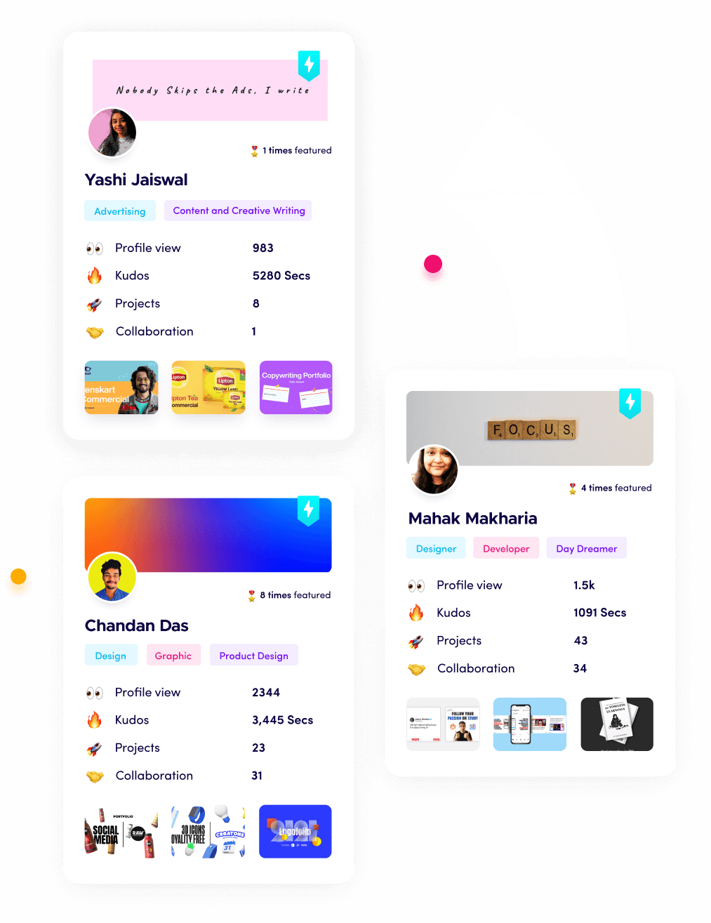
10. Fueler – Assignment-Based Portfolio Proof
On Fueler’s landing page, startups find real assignment outcomes, not just portfolios. Each item shows how the startup solved a problem, with measurable results and the option to start an assignment-based hiring flow directly.
- Display work assignments with data-backed impact
- Category filters by use case or team type
- Fast “Hire through Assignment” flow no long forms
- Portfolio credibility scores and trust signals
Why it matters: For US startups building teams, proof of work builds trust. Fueler’s transparent assignment-first approach reduces hiring guesswork and accelerates team growth with confidence.
Final Thought
The best US startup landing pages in 2025 are clear, interactive, and outcomes-driven. They cut through noise, make trust easy, and drive action instantly. Whether you’re building your MVP or scaling to your first million, applying these conversion tactics and structures will maximize your results in any market. Remember, presenting real proof just as you see on Fueler can help your startup win customers and hires much faster.
Frequently Asked Questions (FAQs)
1. What makes a landing page high-converting for US startups?
Clear headlines, social proof, simple CTAs, interactive demos, and real outcome metrics are essential for boosting conversions.
2. How does Fueler improve startup hiring via landing page?
Fueler’s assignment-based portfolio lets startups see proof of work, ensuring hires align with real needs, and reduces hiring risk.
3. Should pricing be visible on a landing page?
For most SaaS and software startups, showing clear, transparent pricing removes barriers and improves signups.
4. What are the best CTAs for startup conversion pages?
“Get Started Free,” “Book a Demo,” and “See How It Works” are strong, actionable calls to action that drive user engagement.
5. How often should landing pages be updated?
Landing pages should be revisited quarterly to update stats, testimonials, and product features keeping everything fresh and high-converting.
What is Fueler Portfolio?
Fueler is a career portfolio platform that helps companies find the best talents for their organization based on their proof of work.
You can create your portfolio on Fueler, thousands of freelancers around the world use Fueler to create their professional-looking portfolios and become financially independent. Discover inspiration for your portfolio
Sign up for free on Fueler or get in touch to learn more.

What should you do next?
You've read the article. Now turn your skills into proof of work and unlock more opportunities.
Build your proof of work portfolio
Create a clean portfolio with projects, assignments, resumes, and AI stack details that companies actually want to see.
Create your Fueler portfolio →Apply through assignments, not resumes
Stand out by solving real tasks from companies hiring on Fueler.
Explore assignments →Get discovered by companies
Make your work public and let recruiters discover your skills through actual projects instead of keywords.
Get discovered →