70 High-Converting Landing Page Examples for Marketers

Riten Debnath
17 Jul, 2025
Are you looking for proven landing page inspiration that actually drives results? Studying real-world examples is the fastest way to learn what works and why. Here are 15 high-converting landing page examples, each explained in detail so you can apply these winning ideas to your own marketing.
I’m Riten, founder of Fueler a platform that helps marketers showcase their best work and get hired through real assignments. Use these examples to boost your conversion rates and build a portfolio that stands out.
1. Calendly
Calendly’s landing page is designed for simplicity and clarity, welcoming visitors with a direct headline that promises to “Eliminate the back-and-forth of scheduling.” The hero section features a looping demo GIF, showing exactly how the tool works in real time. There’s a single, prominent CTA—“Sign up for free”—which reduces decision fatigue and guides users straight to action. Social proof is established with trusted company logos, and the benefits are listed in concise, easy-to-read sections. The clean layout and minimal distractions keep the focus on conversion, making it a model for SaaS sign-up pages.
2. Loom
Loom’s landing page greets users with a bold headline and a smooth product animation that instantly demonstrates its value. The signup process is frictionless, offering one-click sign-in options with Google and Slack, which removes barriers for new users. Key benefits are highlighted with icons and short descriptions, making it easy to scan. A testimonial carousel adds social proof, while a clear CTA button stands out visually. The minimalist design ensures that the visitor’s attention is always on the product and the next step.
3. Path
Path’s landing page is built for focus, with a single goal: getting users to subscribe to their email newsletter. The design is intentionally minimal, with almost no navigation or external links to distract visitors. The headline and subheadline clearly explain the value of subscribing, while the form is front and center. A brief list of benefits tells users what they’ll receive, and a privacy note reassures them about their information. This approach streamlines the user journey and maximizes conversions for email sign-ups.
4. LUSH Cosmetics
LUSH’s landing page stands out by showcasing its ethical certifications and brand values at the bottom, reinforcing trust for conscious consumers. The page uses vibrant imagery and playful copy to appeal to eco-friendly shoppers. Product benefits are explained in detail, and customer reviews are featured for authenticity. The navigation is simple, guiding users toward making a purchase or learning more. By aligning the landing page with its brand mission, LUSH builds loyalty and drives conversions among value-driven buyers.
5. Netflix (Gift Card)
Netflix’s gift card landing page is a masterclass in brevity and clarity, using a short headline and two clear CTAs—buy or redeem a gift card. The process is broken down into three simple steps, making it easy for users to understand how to use the card. Visuals reinforce the message, and a FAQ section answers common questions without overwhelming the visitor. The page’s minimal design reduces friction and encourages fast decision-making. This approach is perfect for transactional landing pages.
6. Extreme Lounging
Extreme Lounging’s giveaway landing page is ultra-focused, with a hero image, a catchy headline, and a single email form. The offer is clear—a chance to win a free chair—making the value proposition irresistible. There are no unnecessary links or distractions, keeping the user’s attention on the conversion goal. The concise copy explains how to enter and what to expect. This simplicity leads to a high conversion rate, especially for lead generation campaigns.
7. onX
onX’s navigation app landing page boasts a conversion rate above 60% thanks to its focused design and compelling offer. The headline communicates the core benefit, and the CTA is visually prominent. Key features are listed with icons for easy scanning, and a testimonial section builds trust. The page avoids clutter, ensuring that every element supports the main goal—getting users to start a free trial. The design is clean, mobile-friendly, and optimized for quick decisions.
8. Clixr eCommerce
Clixr’s landing page uses vibrant product images and minimal text to engage visitors instantly. Animated taglines highlight key benefits as you scroll, keeping the experience dynamic. The main CTA is bold and repeated throughout the page for maximum visibility. Customer reviews and ratings are integrated seamlessly, adding social proof. The overall design is modern, visually appealing, and laser-focused on driving sales.
9. DataBest
DataBest’s landing page combines engaging animations with a minimalist layout to keep visitors’ attention from start to finish. The headline and subheadline clearly communicate the product’s value, while the benefits are broken down into digestible sections. Navigation is effortless, with anchor links leading to key information. Trust badges and testimonials reinforce credibility. The page’s clean design and smooth user experience make it easy for visitors to take action.
10. Meadlight
Meadlight’s landing page features a unique scrolling animation where the product bottle follows you down the page. The focus is on a single product, with short sections explaining its benefits, ingredients, and serving suggestions. High-quality visuals and concise copy create a sense of luxury and exclusivity. The CTA is clear and repeated at strategic points. This immersive design keeps users engaged and increases the likelihood of conversion.
11. IntimateContest
IntimateContest grabs attention with high-resolution images, kinetic typography, and simple explanations of the contest mechanics. Lazy loading ensures the page loads quickly, even with rich media. The rules and entry process are clearly outlined, reducing confusion. A countdown timer adds urgency, encouraging users to participate before the deadline. The page is designed for mobile responsiveness, making it easy to enter from any device.
12. Shopify
Shopify’s landing page for new store owners is packed with value-driven messaging and a risk-free offer. The headline promises an easy way to start selling online, while the CTA—“Start free trial”—is impossible to miss. Step-by-step visuals walk users through the setup process, reducing anxiety for beginners. Social proof is provided with success stories and logos of well-known brands. The clean, inviting design makes it easy for users to take the first step.
13. HubSpot
HubSpot’s landing page for its CRM tool is designed to educate and convert in one seamless flow. The headline highlights the product’s core benefit—“Grow better with HubSpot CRM”—and a video demo explains how it works. Key features are presented in bullet points, making them easy to scan. A simple form captures leads, while trust signals like awards and user testimonials reinforce credibility. The layout is clean and professional, guiding users toward signing up.
14. Duolingo
Duolingo’s landing page uses playful visuals and a friendly mascot to make language learning feel fun and accessible. The headline encourages users to “Learn a language for free,” and the CTA is bright and inviting. Progress bars and gamified elements show how easy it is to get started. Social proof is provided with user stats and ratings. The page’s cheerful design and clear value proposition drive high sign-up rates.
15. Slack
Slack’s landing page is focused on team collaboration, with a headline that emphasizes productivity and connection. The hero image shows the product in action, while concise copy explains how Slack simplifies communication. The CTA—“Try for free”—is prominent, and a short demo video answers common questions. Customer logos and testimonials build trust, and the clean layout ensures the user’s path to conversion is straightforward.
16. Trello
Trello’s landing page uses a vibrant, colorful design that immediately grabs attention and reflects the product’s playful brand. The headline clearly states the main benefit—organizing work visually—and the hero image displays the product in use. Key features are broken down into short, digestible sections with icons, making them easy to scan. The CTA, “Sign Up – It’s Free,” is repeated and stands out in contrasting colors. Social proof is added with company logos and user testimonials, giving new visitors confidence to try it.
17. Dropbox
Dropbox’s landing page is clean and minimal, focusing on a single headline about file sharing and collaboration. The signup form is right at the top, reducing friction for new users. Benefits are explained in simple language, and the supporting visuals show how Dropbox fits into everyday workflows. The page also highlights integrations with other popular tools, adding value for business users. Security and privacy badges at the bottom build trust with visitors.
18. Mailchimp
Mailchimp’s landing page uses a friendly, conversational tone and quirky illustrations to make email marketing approachable. The headline quickly communicates the main value proposition, and the CTA invites users to “Sign Up Free.” Features are organized into expandable sections, letting users dive deeper as needed. Customer testimonials and awards are included to build credibility. The overall layout is easy to navigate, guiding users toward starting their first campaign.
19. HubSpot (Free CRM)
HubSpot’s CRM landing page focuses on the core benefit—growing better with a free CRM. The hero section uses a strong headline, a brief explainer, and a bold CTA. Product screenshots and a short demo video help visitors see the tool in action. Key features are listed in clear, benefit-driven language. Trust signals like G2 awards and large brand logos reinforce the CRM’s popularity and reliability.
20. Airbnb (Host Signup)
Airbnb’s host signup landing page is visually appealing, with a hero image of a real home and a headline that highlights potential earnings. The signup form is simple and upfront, reducing barriers for new hosts. The page explains the process in three easy steps and includes testimonials from successful hosts. Safety and support information reassures users. The design is mobile-friendly, ensuring a smooth experience on any device.
21. Shopify (Free Trial)
Shopify’s free trial page is designed to eliminate risk and encourage immediate action. The headline promises an easy start to selling online, and the signup form is front and center. Step-by-step visuals walk users through the setup process, reducing anxiety for beginners. Social proof is provided with success stories and logos of well-known brands. The clean, inviting design makes it easy for users to take the first step.
22. ClickFunnels
ClickFunnels’ landing page is built to convert, with a bold headline promising increased sales and leads. A video testimonial from the founder adds a personal touch and credibility. The benefits of using ClickFunnels are broken down into clear, actionable steps. Scarcity is created with a limited-time offer and countdown timer. The page features plenty of social proof, including user reviews and earnings screenshots.
23. ConvertKit
ConvertKit’s landing page for creators uses a clean, modern design with a focus on simplicity. The headline speaks directly to creators looking to grow their audience. The signup form is easy to find, and the benefits of the platform are explained with icons and short text. Customer success stories are featured prominently. The overall design is friendly and welcoming, encouraging new users to get started.
24. Webflow
Webflow’s landing page showcases its design flexibility with a visually stunning layout and interactive product demo. The headline highlights the power of building websites visually, and the CTA invites users to start for free. Key features are explained with animated visuals and concise descriptions. Customer logos and testimonials add credibility. The page ends with a FAQ section to address common concerns.
25. Notion
Notion’s landing page is minimal and focused, with a headline that emphasizes organization and productivity. The hero image shows the product in use, making it easy for visitors to envision themselves using it. The CTA is clear and repeated throughout the page. Key features are explained in short, benefit-driven sections. Social proof from well-known companies and user testimonials builds trust.
26. Asana
Asana’s landing page uses a clean design with a focus on team productivity and project management. The headline highlights the main benefit, and the signup form is easily accessible. Product screenshots and a short explainer video help users understand how Asana works. Key features are listed with icons and brief descriptions. The page also includes customer logos and testimonials for added credibility.
27. Monday.com
Monday.com’s landing page is visually engaging, with bright colors and dynamic animations. The headline promises better team collaboration, and the signup form is simple and prominent. Key features are explained with short, actionable text and product visuals. Social proof is provided with user reviews and company logos. The design is mobile-responsive and easy to navigate.
28. Leadpages
Leadpages’ landing page is optimized for conversions, with a direct headline and a clear CTA to start a free trial. The benefits of the platform are explained in short, persuasive sections. Product screenshots and a demo video show how easy it is to build landing pages. Customer testimonials and case studies add credibility. The page is designed to minimize distractions and keep users focused on signing up.
29. Instapage
Instapage’s landing page focuses on the promise of higher conversions with personalized landing pages. The headline is bold, and the CTA stands out in contrasting colors. Key features are explained with icons and short text. A demo video and customer logos provide social proof. The page is clean and professional, guiding users toward requesting a demo or starting a trial.
30. Unbounce
Unbounce’s landing page is built for marketers who want more control and higher conversions. The headline highlights the main benefit, and the signup form is front and center. Product features are explained with visuals and concise descriptions. Case studies and testimonials showcase real-world results. The design is modern, mobile-friendly, and focused on driving signups.
31. FreshBooks
FreshBooks’ landing page uses a friendly headline and a prominent free trial CTA to draw in small business owners. The benefits are clearly listed with checkmarks, making it easy to scan. Product screenshots show the intuitive interface, and testimonials from real users build trust. The page is clutter-free, focusing on the main conversion goal. Security badges and a money-back guarantee reduce risk for new signups.
32. Squarespace
Squarespace’s landing page features beautiful visuals and a direct headline about building your website easily. The page uses a video background to showcase templates in action. The signup form is simple and always visible as you scroll. Key features are presented in short, benefit-driven sections. Awards and customer logos add credibility, and the design is sleek and modern.
33. Buffer
Buffer’s landing page is clean and focused, with a headline that speaks directly to social media managers. The CTA to start a free trial is repeated for emphasis. Product benefits are explained in short, actionable points, and a demo video shows the tool in use. Testimonials from well-known brands add social proof. The page is optimized for both desktop and mobile.
34. Wix
Wix’s landing page highlights the ease of building a website with a bold headline and a quick-start CTA. The hero image features a drag-and-drop editor in action. Key features are explained with icons and brief descriptions. The page includes user reviews and examples of real websites built with Wix. The design is bright, friendly, and easy to navigate.
35. OptinMonster
OptinMonster’s landing page is focused on lead generation, with a headline promising more subscribers and sales. The CTA is bold and supported by a risk-free trial. Benefits are explained in bullet points, and a demo video shows how easy it is to set up campaigns. Trust badges and customer testimonials reinforce credibility. The layout is uncluttered and conversion-focused.
36. Zapier
Zapier’s landing page uses a clear headline to explain its automation benefits. The hero section features a product demo GIF and a simple signup form. Key integrations are highlighted with logos, making it easy for users to see what’s possible. The page includes customer testimonials and case studies. The design is minimal and focused on getting users to start automating.
37. Intercom
Intercom’s landing page uses a conversational headline and a product screenshot that shows the chat interface in action. The CTA stands out in a contrasting color. Benefits are explained in short sections, and a customer carousel adds social proof. The page also includes a short explainer video and a FAQ section. The design is modern and easy to navigate.
38. Crazy Egg
Crazy Egg’s landing page promises better website insights with a headline focused on heatmaps and analytics. The signup form is right at the top, minimizing friction. Key features are explained with visuals and brief descriptions. A demo video and customer testimonials add credibility. The layout is clean, with plenty of white space to keep users focused.
39. Drift
Drift’s landing page is built around conversational marketing, with a headline that invites users to “Talk to your website visitors.” The hero image shows the chat tool in use, and the CTA is bold and clear. Benefits are listed in short, actionable points. Customer logos and testimonials provide social proof. The design is sleek and conversion-focused.
40. Leadpages (Webinar)
Leadpages’ webinar landing page uses a countdown timer to create urgency and a clear headline about the value of the event. The signup form is simple, and the benefits of attending are explained in bullet points. Speaker bios and testimonials add credibility. The page is mobile-friendly and designed to maximize registrations. Social sharing buttons encourage users to spread the word.
41. Typeform
Typeform’s landing page is interactive, letting users experience the form tool right away. The headline focuses on creating engaging forms and surveys. Key features are explained with icons and short text. Customer stories and logos add trust. The design is playful, modern, and encourages users to start building their own form.
42. Teachable
Teachable’s landing page targets creators and educators with a headline about building online courses. The hero image shows the product dashboard, and the CTA invites users to start for free. Benefits are listed in concise sections, and customer testimonials add social proof. The page includes a FAQ section to address common questions. The layout is clean and easy to follow.
43. Kajabi
Kajabi’s landing page is focused on helping users monetize their knowledge. The headline is direct, and the CTA stands out. Product features are explained with visuals and short descriptions. Customer success stories and earnings screenshots add credibility. The design is professional and encourages users to start a free trial.
44. Thinkific
Thinkific’s landing page highlights the platform’s ease of use for creating online courses. The hero section features a product demo and a bold CTA. Benefits are listed in bullet points, and customer testimonials are included. The page also features a comparison chart with competitors. The layout is simple, clean, and conversion-focused.
45. Podia
Podia’s landing page uses a friendly headline and a product screenshot to show how easy it is to sell courses and digital products. The CTA is clear and repeated throughout the page. Key features are explained with icons and short text. Customer testimonials and ratings add social proof. The design is modern and easy to navigate.
46. Webinars Ninja
Webinars Ninja’s landing page is built to maximize signups for live events. The headline promises actionable learning, and the registration form is front and center. Benefits of attending are listed in bullet points. Speaker bios and past attendee testimonials add credibility. The page uses a countdown timer to create urgency.
47. ConvertFlow
ConvertFlow’s landing page focuses on personalized calls-to-action for websites. The headline is benefit-driven, and the CTA is prominent. Product features are explained with visuals and short descriptions. Customer logos and testimonials add trust. The design is clean and optimized for conversions.
48. GetResponse
GetResponse’s landing page highlights its all-in-one marketing platform with a headline about growing your audience. The signup form is simple, and the CTA is bold. Key features are explained in short, benefit-driven sections. Customer reviews and trust badges build credibility. The layout is modern and easy to use.
49. ActiveCampaign
ActiveCampaign’s landing page uses a headline focused on customer experience automation. The hero section features a product screenshot and a clear CTA. Benefits are listed with icons and short descriptions. Customer testimonials and ratings add social proof. The page is designed to guide users toward starting a free trial.
50. Sendinblue
Sendinblue’s landing page is focused on email marketing, with a headline about growing your business. The signup form is front and center, reducing friction. Key features are explained in concise sections. Customer logos and testimonials add credibility. The design is simple, modern, and optimized for conversions.
51. AWeber
AWeber’s landing page uses a headline about building better email campaigns and a prominent CTA. Product features are explained with visuals and short text. Customer reviews and trust badges provide social proof. The page is clean and easy to navigate. A FAQ section addresses common concerns.
52. Constant Contact
Constant Contact’s landing page is focused on small business email marketing. The headline promises easy campaign creation, and the signup form is simple. Key features are explained in short, benefit-driven sections. Customer testimonials and ratings add trust. The design is modern and conversion-focused.
53. MailerLite
MailerLite’s landing page uses a friendly headline and a product demo to show how easy it is to create email campaigns. The CTA is bold and repeated throughout the page. Key features are explained with icons and short descriptions. Customer reviews and trust badges build credibility. The layout is clean and easy to use.
54. ConvertBox
ConvertBox’s landing page focuses on website engagement tools, with a headline about increasing leads and sales. The CTA is prominent, and the product features are explained with visuals and short text. Customer testimonials and ratings add social proof. The page is clean and optimized for conversions.
55. Sumo
Sumo’s landing page is built for lead generation, with a headline about growing your email list. The signup form is simple and front and center. Key features are explained in short, actionable sections. Customer logos and testimonials provide trust. The design is modern and easy to navigate.
56. Privy
Privy’s landing page targets eCommerce stores with a headline about boosting sales. The CTA is bold, and the signup form is quick to complete. Product features are explained with visuals and short descriptions. Customer reviews and trust badges add credibility. The page is clean and conversion-focused.
57. Sleeknote
Sleeknote’s landing page uses a headline about creating engaging popups and a product demo GIF. The signup form is simple, and the benefits are explained in bullet points. Customer testimonials and ratings add social proof. The design is modern and easy to use. A FAQ section addresses common questions.
58. Hello Bar
Hello Bar’s landing page is focused on website notifications, with a headline about converting visitors into customers. The CTA is prominent, and the product features are explained with visuals and short text. Customer reviews and trust badges provide credibility. The page is clean and optimized for conversions.
59. Wishpond
Wishpond’s landing page targets marketers with a headline about generating more leads. The signup form is simple and front and center. Key features are explained in short, benefit-driven sections. Customer testimonials and ratings add trust. The design is modern and easy to navigate.
60. Instantly
Instantly’s landing page uses a headline about sending more cold emails that convert. The CTA is bold and repeated throughout the page. Product features are explained with visuals and short descriptions. Customer reviews and trust badges build credibility. The layout is clean and optimized for conversions.
61. Landingi
Landingi’s landing page is focused on easy landing page creation, with a headline about building pages without coding. The signup form is simple, and the CTA is prominent. Key features are explained in short, benefit-driven sections. Customer testimonials and ratings add trust. The design is modern and easy to use.
62. Carrd
Carrd’s landing page is minimal and focused, with a headline about building simple, responsive sites. The signup form is front and center, reducing friction. Key features are explained in concise sections. Customer reviews and trust badges provide credibility. The design is clean and optimized for conversions.
63. Launchrock
Launchrock’s landing page targets startups with a headline about launching new ideas quickly. The signup form is simple and front and center. Key features are explained in short, actionable sections. Customer testimonials and ratings add trust. The design is modern and easy to navigate.
64. KickoffLabs
KickoffLabs’ landing page is focused on viral lead generation, with a headline about running successful referral campaigns. The CTA is bold and repeated throughout the page. Product features are explained with visuals and short descriptions. Customer reviews and trust badges build credibility. The layout is clean and optimized for conversions.
65. Pagewiz
Pagewiz’s landing page uses a headline about creating high-converting pages easily. The signup form is simple, and the CTA is prominent. Key features are explained in short, benefit-driven sections. Customer testimonials and ratings add trust. The design is modern and easy to use.
66. Ucraft
Ucraft’s landing page is focused on website building, with a headline about launching a site in minutes. The signup form is front and center, reducing friction. Key features are explained in concise sections. Customer reviews and trust badges provide credibility. The design is clean and optimized for conversions.
67. Lander
Lander’s landing page uses a headline about building landing pages that convert. The CTA is bold and repeated throughout the page. Product features are explained with visuals and short descriptions. Customer reviews and trust badges build credibility. The layout is clean and optimized for conversions.
68. Instapage (PPC)
Instapage’s PPC landing page is focused on maximizing ad spend, with a headline about increasing conversions. The signup form is simple and front and center. Key features are explained in short, benefit-driven sections. Customer testimonials and ratings add trust. The design is modern and easy to navigate.
69. GetLandy
GetLandy’s landing page is focused on agencies and marketers, with a headline about building custom landing pages. The CTA is bold and repeated throughout the page. Product features are explained with visuals and short descriptions. Customer reviews and trust badges build credibility. The layout is clean and optimized for conversions.
70. Swipe Pages
Swipe Pages’ landing page highlights fast, mobile-optimized landing page creation. The headline is direct, and the signup form is simple. Key features are explained in short, actionable sections. Customer testimonials and ratings add trust. The design is modern, clean, and conversion-focused.
Final Thought
These 70 landing page examples show that clarity, focus, and trust-building are the keys to high conversion rates. Use their best ideas to inspire your own pages, and remember—showcasing your landing page work on Fueler can help you get noticed and hired by top companies.
FAQs
1. What makes a landing page convert well?
Clarity, a strong value proposition, a single CTA, social proof, and minimal distractions are key factors in high-converting landing pages.
2. How do I choose the right landing page style for my business?
Study examples in your industry, test different layouts, and focus on what matches your brand and audience expectations.
3. Why is social proof important on landing pages?
Testimonials, reviews, and trust badges build credibility and reduce hesitation, making visitors more likely to convert.
4. Should I use video on my landing page?
Videos can boost engagement and explain complex offers quickly, but always test to see if they improve your conversion rates.
5. How can I showcase my landing page work to get hired?
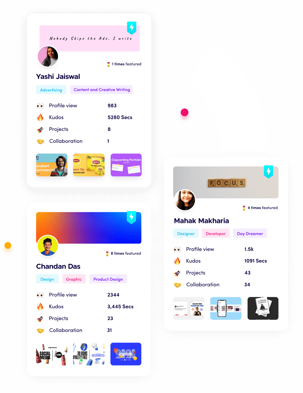
Build a portfolio on Fueler, where you can organize your best landing pages, show real results, and attract companies looking for proven marketing talent.
What is Fueler Portfolio?
Fueler is a career portfolio platform that helps companies find the best talents for their organization based on their proof of work.
You can create your portfolio on Fueler, thousands of freelancers around the world use Fueler to create their professional-looking portfolios and become financially independent. Discover inspiration for your portfolio
Sign up for free on Fueler or get in touch to learn more.

What should you do next?
You've read the article. Now turn your skills into proof of work and unlock more opportunities.
Build your proof of work portfolio
Create a clean portfolio with projects, assignments, resumes, and AI stack details that companies actually want to see.
Create your Fueler portfolio →Apply through assignments, not resumes
Stand out by solving real tasks from companies hiring on Fueler.
Explore assignments →Get discovered by companies
Make your work public and let recruiters discover your skills through actual projects instead of keywords.
Get discovered →