Google’s New Icon Redesign Explained, And How Designers Can Turn It Into Portfolio Projects

Riten Debnath
23 May, 2026
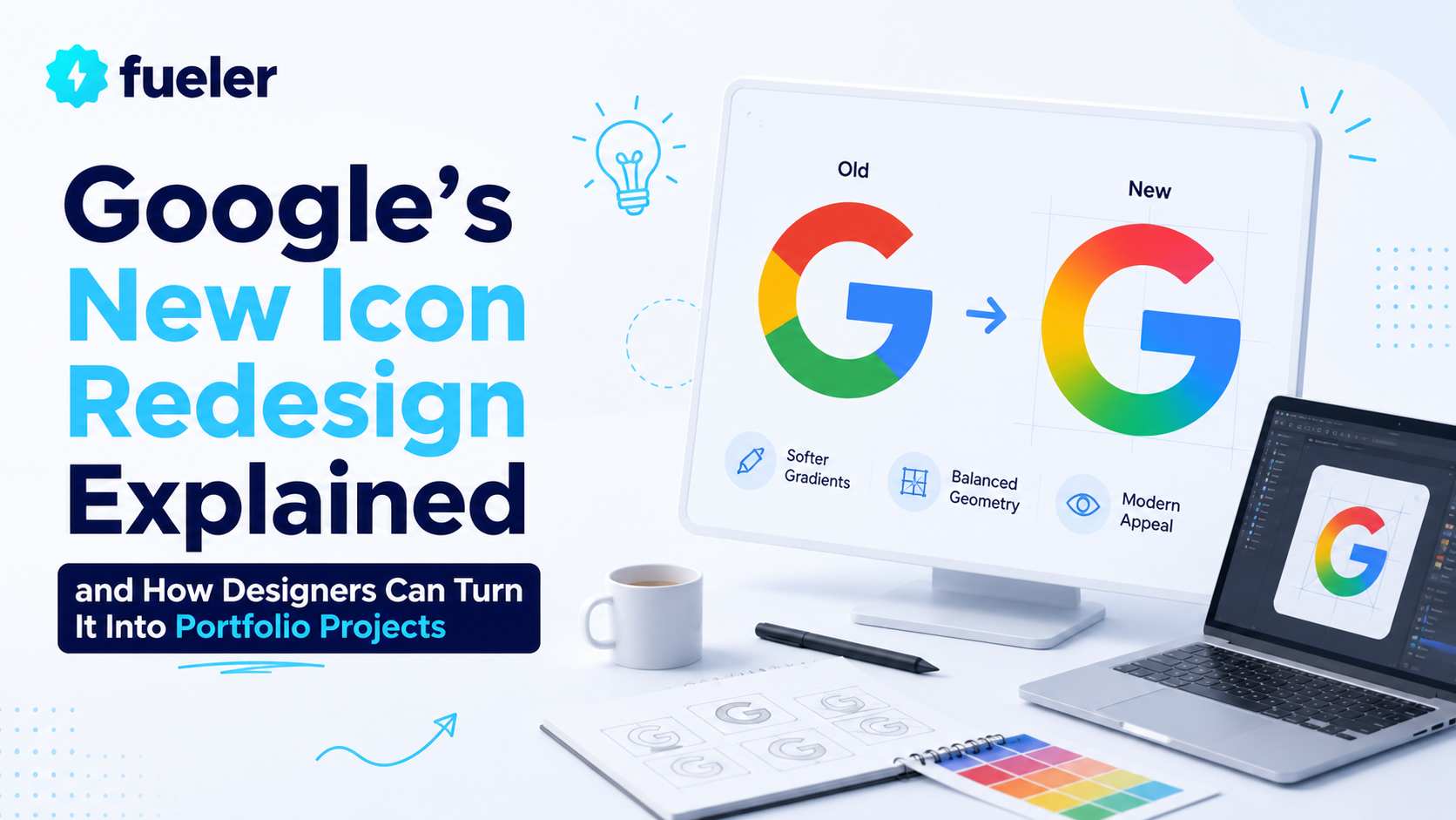
In April 2026, Google started rolling out a fresh visual update across some of its biggest apps like Gmail, Google Calendar, Google Drive, and other Workspace products. The redesign focused heavily on gradients, softer transitions, and a more modern AI-era visual identity. Reports from publications like Yahoo Tech, Fast Company, and 9to5Google highlighted how Google is slowly moving away from flat colors and moving toward richer, more blended icon systems.
For most users, this may feel like a small update.
But for designers, this is a huge signal.
As someone building Fueler, a platform where people showcase proof of work and get hired through assignments, I always tell young designers one thing:
The best way to grow is to redesign products you already use every day.
Google’s icon update is a perfect opportunity to do that.
What Changed in Google’s New Icons?
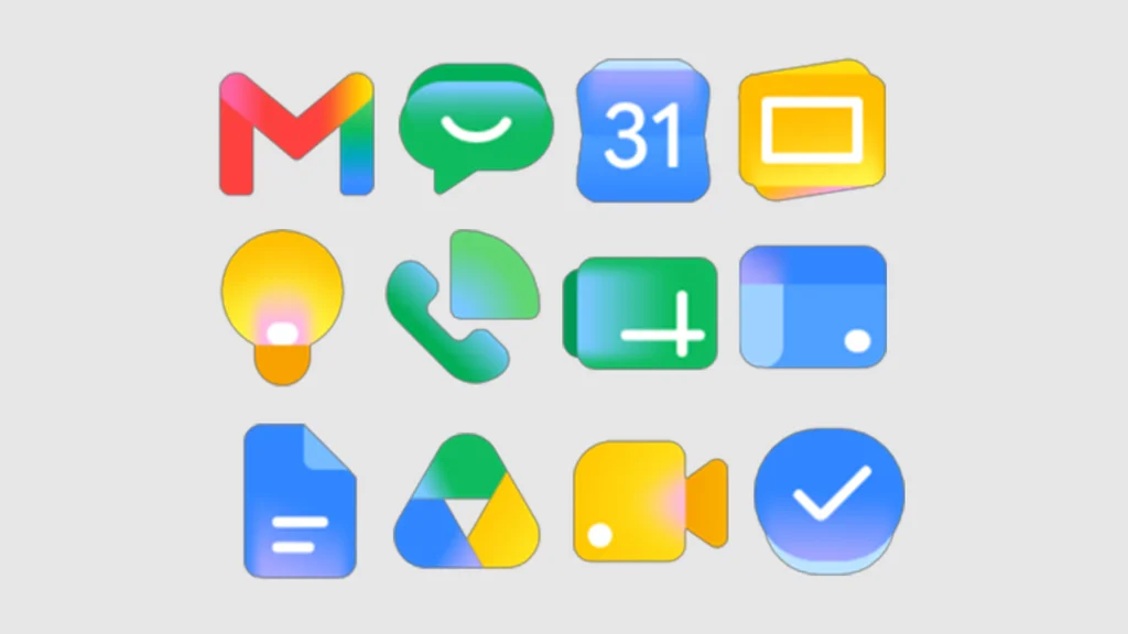
Source: Google
According to public reports, Google’s latest icon refresh introduces:
- Softer gradients
- More depth and motion feel
- Better consistency across Workspace apps
- Visual identity aligned with AI products
- More vibrant blending of Google’s four signature colors
The update is subtle, but intentional.
Google understands something important:
Icons are no longer just shortcuts.
They are brand identity for them.
When users open Gmail or Drive, the icon is often the first thing they see. In a mobile-first world, icons shape memory, trust, and recognition.
That is why companies keep redesigning them and polishing them.
Why Big Companies Redesign Icons So Often
Many people online asked:
“Why redesign icons when the old ones worked?”
The answer is simple.
Design trends evolve.
Devices evolve.
User behavior evolves.
A modern icon system needs to work across:
- Phones
- Tablets
- Watches
- Desktop apps
- AI interfaces
- Dark mode
- Notifications
- Widgets
An icon designed five years ago may not feel modern anymore.
Google is not alone here.
Companies like Instagram, Spotify, Airbnb, and Uber have all redesigned their app icons multiple times.
The companies that survive for decades keep evolving visually.
The Biggest Lesson Designers Should Learn From This
Do not wait for a client to give you work.
Create your own design challenges.
This is one of the fastest ways to improve your skills.
When you redesign a real product:
- You learn visual systems
- You understand branding
- You improve UX thinking
- You practice constraints
- You build portfolio proof
And most importantly:
You become visible online.
Why Redesign Challenges Work So Well
At Fueler, I have seen many designers struggle with one thing:
“I know design, but I don’t have projects.”
The solution is simple.
Create practice projects using real-world brands.
Companies care less about certificates.
They care more about proof of work.
A strong redesign project shows:
- taste
- execution
- thinking
- communication
- creativity
Even if the project is self-initiated.
Many great designers got freelance clients or full-time jobs because of redesign concepts they posted online.
10 Brand Redesign Challenges Designers Can Start Today
Here are 10 brands any designer can redesign as practice projects and publish as proof of work on Fueler.
1. Netflix
Challenge ideas:
- Redesign the mobile app icon
- Create a dark mode icon pack
- Build a cinematic visual identity
Why it’s good:
Netflix has strong branding and lots of visual assets to explore
2. Spotify
Challenge ideas:
- Create animated icons
- Redesign playlist covers
- Make AI-generated music identity concepts
Why it’s good:
Music apps allow experimentation with gradients and motion.
3. Swiggy
Challenge ideas:
- Festival icon redesign
- Delivery-themed visual system
- Hyperlocal India-focused branding
Why it’s good:
You learn regional branding and app-first thinking.
4. Zomato
Challenge ideas:
- Minimal icon redesign
- AI recommendation interface concepts
- Notification icon systems
Why it’s good:
You can explore UI + branding together.
5. Discord
Challenge ideas:
- Gaming-focused icon variants
- Community branding system
- Gradient redesign concepts
Why it’s good:
Strong community culture makes design experiments interesting.
6. Notion
Challenge ideas:
- Modern 3D icon concepts
- AI-first productivity branding
- Minimal black-and-white redesigns
Why it’s good:
Great for minimal and system-based designers.
7. Duolingo
Challenge ideas:
- Mascot redesign
- Gamified icon pack
- Student-friendly UI visuals
Why it’s good:
Perfect for playful visual experimentation.
8. Adobe
Challenge ideas:
- Unified creative suite icons
- Modern gradient systems
- Creator-first app branding
Why it’s good:
Helps understand large design ecosystems.
9. Flipkart
Challenge ideas:
- Bharat-focused icon system
- Festive shopping identity
- Mobile-first redesign
Why it’s good:
Excellent for understanding Indian consumer behavior.
10. LinkedIn
Challenge ideas:
- AI networking identity
- Personal branding visuals
- Creator-focused icon redesigns
Why it’s good:
Especially useful for designers building public portfolios.
How to Turn These Challenges Into Real Career Opportunities
Here is the biggest mistake many designers make:
They redesign something.
Post one image.
Then move on.
Instead, treat redesigns like case studies.
Document:
- Your research
- Your thinking
- Color choices
- Typography decisions
- User problems
- Before vs after comparisons
This makes your work look professional.
At Fueler, we built the platform exactly for this kind of proof-of-work portfolio.
Instead of just saying:
“I know design.”
You can show:
“Here’s how I redesigned a product used by millions.”
That changes everything during hiring.
Why Proof of Work Matters More in the AI Era
AI tools are making design faster.
But companies still need:
- creative thinking
- taste
- storytelling
- systems thinking
- execution quality
The internet is moving toward portfolios over resumes.
People want to see what you can actually do.
That is why redesign challenges are becoming powerful career assets.
A strong public project can:
- attract recruiters
- get freelance clients
- build your audience
- improve your skills
- create credibility online
My Advice to Young Designers
Do not wait for permission.
Pick a brand.
Redesign one thing.
Publish it publicly.
Repeat this every month.
In one year, you will have:
- 12 strong projects
- better design thinking
- a visible online identity
- real proof of work
That alone can separate you from thousands of designers.
And if you publish these projects on Fueler, your work becomes part of your professional portfolio that companies can directly evaluate during hiring.
The future belongs to builders who show their work publicly.
Final Thoughts
Google’s new app icon update is more than a visual refresh.
It reflects how modern brands are adapting for the AI-first internet.
For designers, this is not just news.
It is an opportunity.
Every redesign you see online can become:
- a learning challenge
- a portfolio project
- a proof-of-work asset
- a career opportunity
The internet rewards creators who practice publicly.
Start now.
FAQs
Why did Google redesign its app icons in 2026?
Google redesigned its app icons to create a more modern and unified visual identity across Workspace products. The new gradient-focused style also aligns better with AI-era interfaces and modern device ecosystems.
How can redesign challenges help graphic designers get jobs?
Redesign challenges help designers build proof-of-work portfolios. Companies can see real design thinking, creativity, and execution instead of only resumes or certificates.
What are the best brands for beginner UI and icon redesign practice?
Popular choices include Netflix, Spotify, Swiggy, Zomato, LinkedIn, Notion, and Discord because these products already have strong visual systems and large user bases.
Where should designers publish redesign case studies?
Designers can publish redesign projects on portfolio platforms like Fueler, along with LinkedIn, Behance, and personal websites to increase visibility and hiring opportunities.
Are self-initiated design projects valuable for hiring?
Yes. Many recruiters and startups value self-initiated projects because they show initiative, consistency, creativity, and real-world problem-solving ability.
What should you do next?
You've read the article. Now turn your skills into proof of work and unlock more opportunities.
Build your proof of work portfolio
Create a clean portfolio with projects, assignments, resumes, and AI stack details that companies actually want to see.
Create your Fueler portfolio →Apply through assignments, not resumes
Stand out by solving real tasks from companies hiring on Fueler.
Explore assignments →Get discovered by companies
Make your work public and let recruiters discover your skills through actual projects instead of keywords.
Get discovered →