2023 Fonts: The 11 Best Alternatives to Helvetica

Rahul
16 Jun, 2023
Are you feeling a little bored with Helvetica? Who can blame you – after all, the modernist go-to font dates back to 1957. As 2023 approaches, it’s time to freshen things up and find some font alternatives that are a bit more inspired!
Whether you’re looking for something classic, modern, or a bit retro, this list of amazing Helvetica alternatives has something for every designer who wants to take their typography to the next level.
And who knows? Your next masterpiece may even feature innovative pairings between two of these fonts.
In this article, we’ll introduce you to better font options than Helvetica – specifically 11 great alternatives that are sure to get those creative juices flowing.
Let’s jump in and explore what each one has to offer!
What Is Helvetica Font?
If you're a designer looking for a font in 2023, chances are you're looking for an alternative to Helvetica. Used in countless logos, advertisements, and printed materials, Helvetica is a classic sans-serif font that has been around since 1957.
It's known for its timelessness and simplicity—making it an incredibly popular choice among design professionals and novices alike.
However, if you're looking to shake things up with a modern twist on the classic sans-serif font style, there are plenty of alternatives out there.
In this article, we'll explore twelve of the best fonts that offer similar characteristics to Helvetica—but with their own unique spin on things. Read on to find out more about these great alternatives!
1. Akzidenz Grotesk: A Distinctly German Typeface
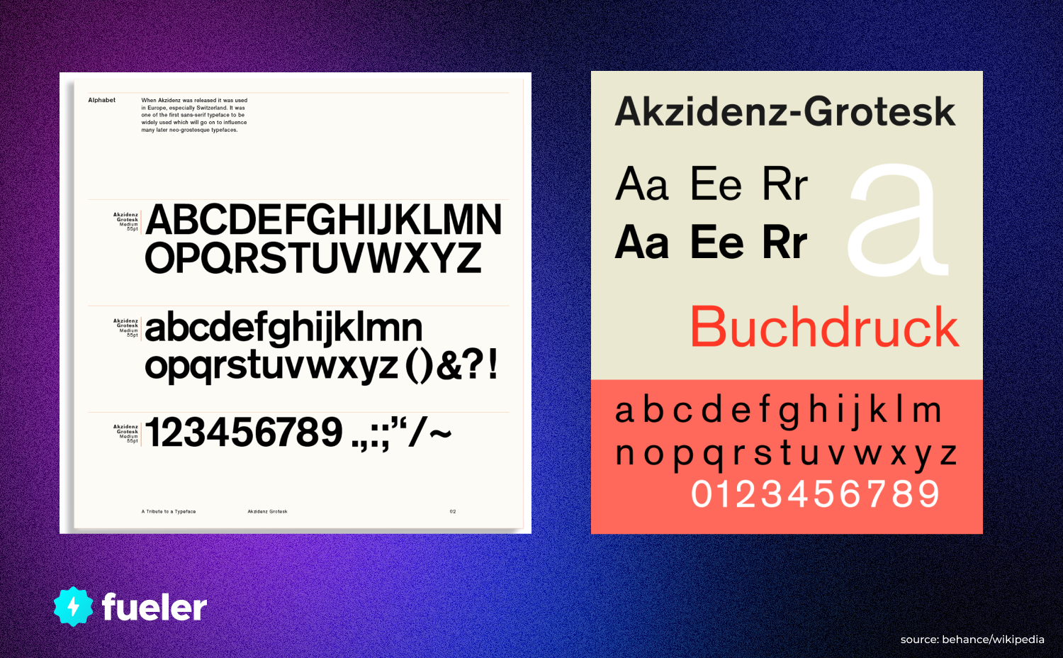
Akzidenz Grotesk Font
If you're looking for a typeface that is the perfect balance between modern and vintage, then Akzidenz Grotesk is the font for you. This German-born sans-serif typeface was originally developed in the late 19th century as a solution to the standard posters of the time.
Today, it stands as a distinct alternative to Helvetica; one that evokes culture and sophistication without becoming too overwhelming.
Akzidenz Grotesk is frequently used in luxury branding, adverts, and magazine covers where a crisp yet elegant feel is desired. Its sharp edges give it strength while its rounded curves add subtlety and personality — making it an ideal choice for creating a timeless design with visual impact.
With its widespread use in print, digital media, corporate identity logos, film titles, and web design — Akzidenz Grotesk remains one of the most enduring typefaces of our time.
So if you’re looking for an alternative to Helvetica that perfectly captures both classic and contemporary styles, then Akzidenz Grotesk should definitely be on your list.
2. Gill Sans: A Refined English-Style Font
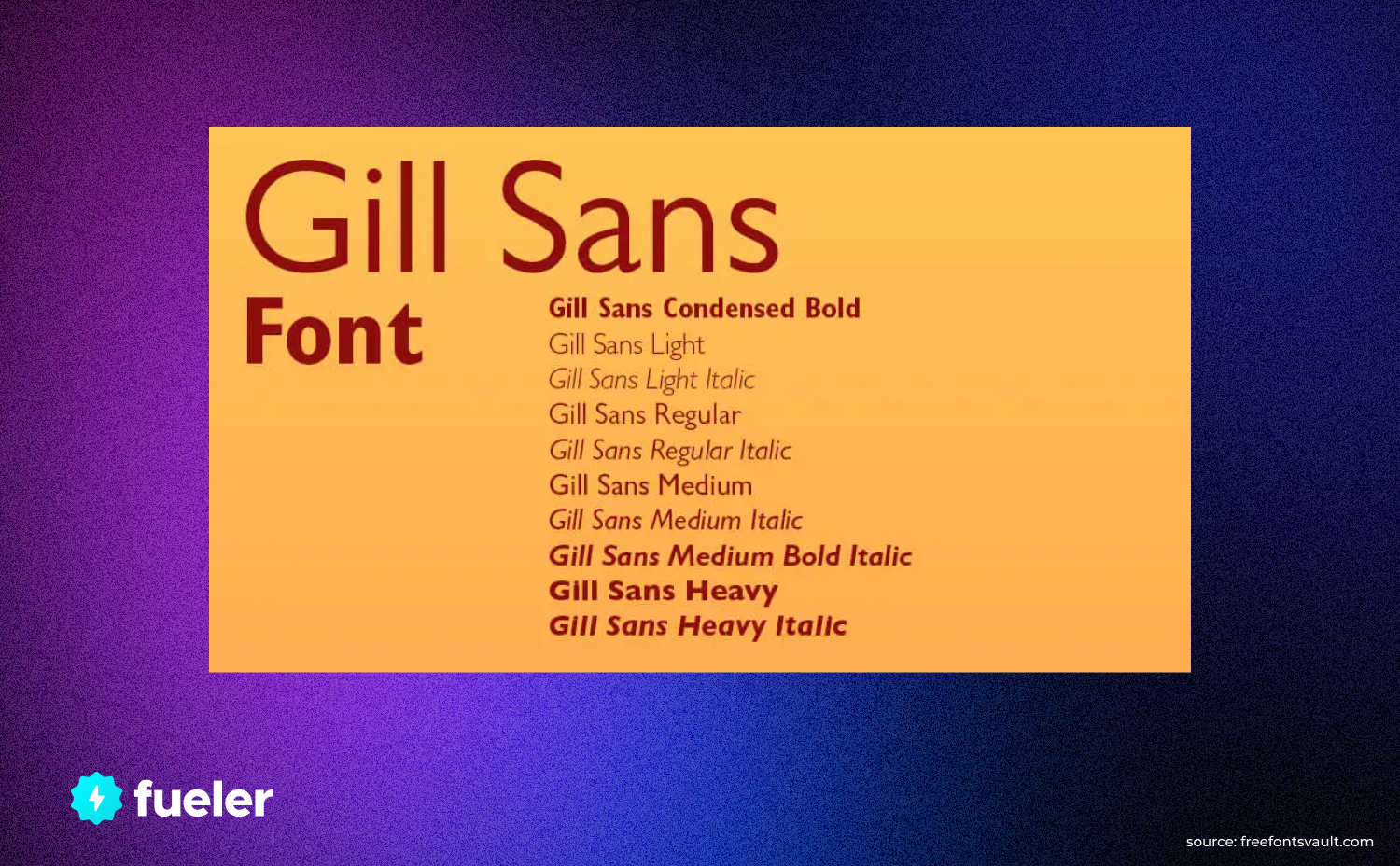
gill sans
Gill Sans, designed by the English designer Eric Gill in 1928, is an amazing alternative to Helvetica. It is a sans-serif humanist font that has a relaxed and distinguished feel.
Gill Sans is a very versatile font that can be used in both formal or informal situations. It’s a perfect fit for branding, logos and packaging. Its design also works well for headlines, titles, and captions.
This typeface has gained quite some popularity among professional creatives because of its clean and balanced design. Its subtle curves make it look polished without appearing overly corporate or rigid.
Its various weights also allow you to customize your design to suit the specific needs of any project.
For those who want an elegant look for their projects, Gill Sans is highly recommended! Its sharp lines and refined shapes are perfect for creating a timeless look – no matter the year!
3. Univers: A Futuristic Swiss Design
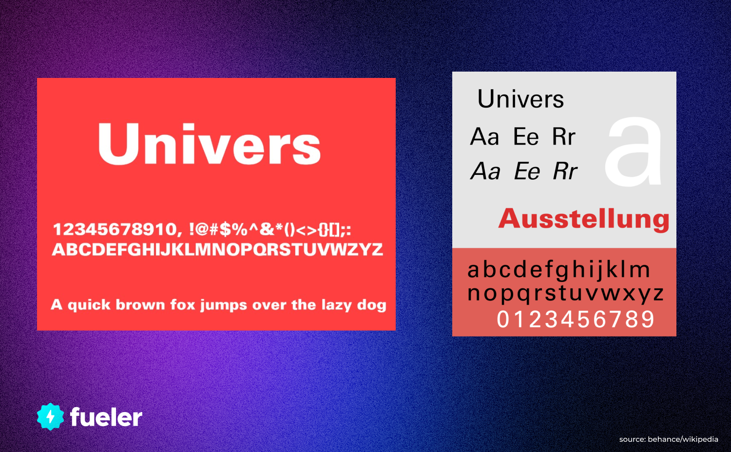
Univers Font
When designers think of a classic Swiss design that looks to the future, they usually turn to Univers.
Univers was created in 1954 by Swiss-type designer Adrian Frutiger, and it was designed to be suitable for signage and other projects.
Univers is seen as a modern counterpart to Helvetica, but with less contrast between thick and thin strokes, which makes it more legible when it comes to smaller text.
Univers is available in many different weights, from ultra-light all the way up to extra-black, making it a great choice for typographic projects.
What makes Univers such an attractive alternative for 2023 are some of its more unique features:
- It has a wide range of weights and widths available – from extra-light condensed all the way up to super-black extended
- Univers is crafted with intricate details that allow for subtle nuances in typographic designs
- It has an industrial feel that gives its letters a timeless esthetic
- The font family comes with oblique versions so you can get creative with your designs
- When used alongside Helvetica or other sans-serif fonts, Univers adds richness and depth to typography compositions
The futuristic Swiss design of Univers makes it one of the best alternatives to Helvetica in 2023. With its wide range of weights and widths, along with its intricate details and industrial feel, designers can create stunning typography compositions that have timeless appeal.
4. Frutiger: Simple and Modern Design
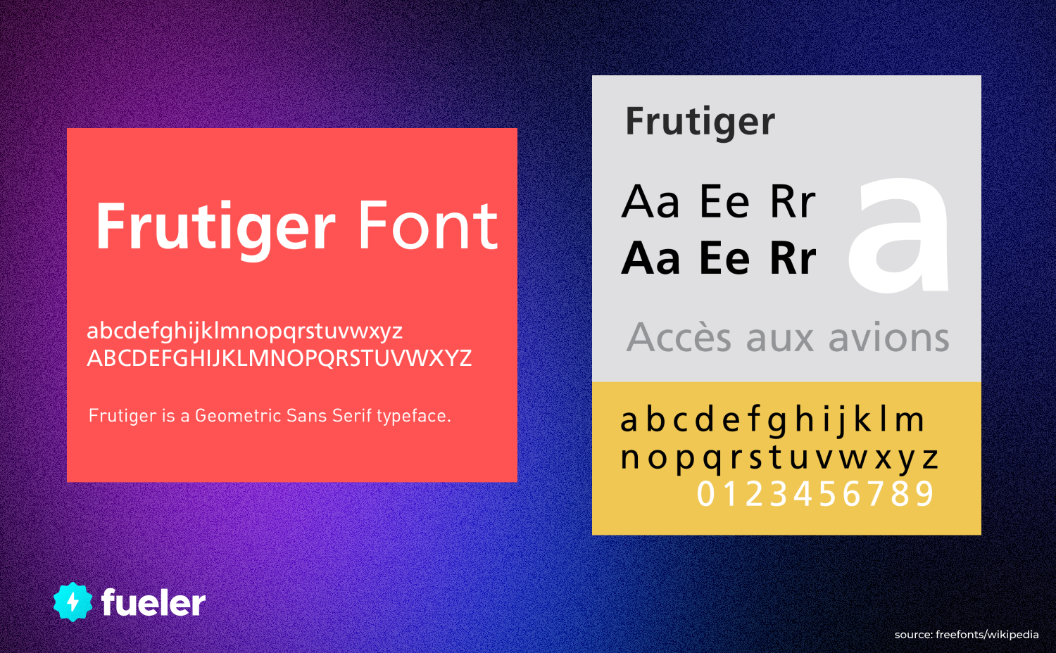
Frutiger Font
If you're looking for a font similar to Helvetica that has a modern and timeless design, then Frutiger is the one for you.
This sans serif font was designed by Adrian Frutiger in 1976, and it's one of the few fonts that's been created to be used for both text and display purposes.
Frutiger is best known for its simple, yet sleek uppercase letters with rounded curves, large terminals, and clean lines.
This typeface also has small counters, making it good for screen use at lower resolutions. Additionally, there are OpenType features like old-style figures and swashes available in some of the heavier weights.
The overall look of Frutiger is inspired by classic grotesques while featuring modern touches like tapered stroke endings.
Combined with its legibility, this makes it an ideal choice for logo designs as well as headlines or body text in print or digital materials.
5. Neue Frutiger: Reimagining the Design Classics
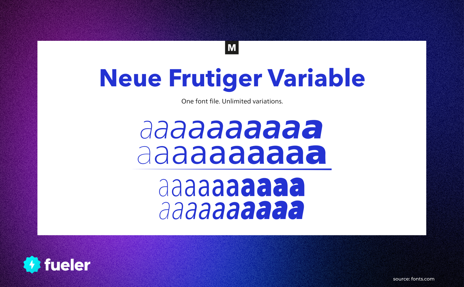
Neue Frutiger
If you’re looking for something a bit different than Helvetica, but with the same classic feel, check out Neue Frutiger.
This font was crafted by Swiss designer Adrian Frutiger who was inspired by classic typefaces from the Renaissance period.
The result is Neue Frutiger – a unique blend of modern and classic shapes that stands out in any design. The font offers an impressive range of weights – 8 in total – which allows you to craft a unique, toned-down design or something more bold and eye-catching.
Plus, Neue Frutiger also comes with features like ligatures, old-style Figures and symbols which add an even greater level of detail to the text.
So if you’re looking for a traditional font that stands out, consider Neue Frutiger as it’s sure to give your designs a unique touch.
6. Theinhardt: Helvetica in Its Simplest Form
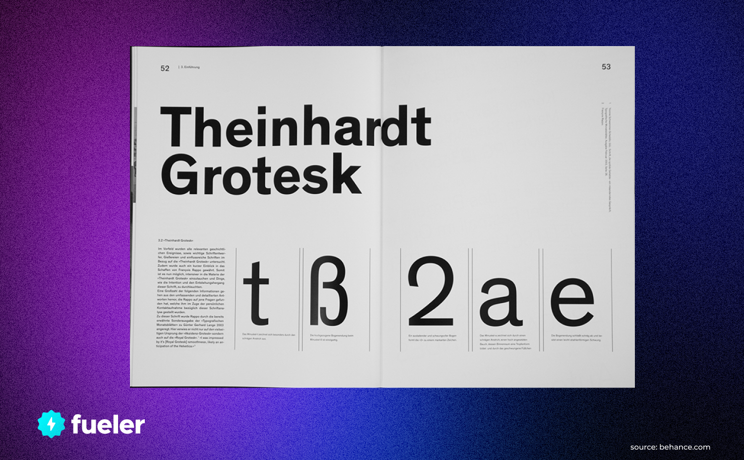
Theinhardt font
If you're looking for a font that is strikingly similar to Helvetica—but "simpler," then look no further than Theinhardt.
This font is all about keeping things minimal, yet bold. It features a crisp, clean feeling that gives your text an upscale and professional look.
Theinhardt was designed by Hannes Thienhardt, who has said he aimed "to create a typeface which is neither traditional nor modern but timeless." He achieved his goal for sure!
Here are some of Theinhardt's standout features:
- Geometric shapes
- Slightly slimmer stroke widths than Helvetica
- 81 characters in one weight and style
- Five weights and styles in all
- Monospaced lining figures & oldstyle figures with tabular lining figures (lined up)
- OpenType Features such as Small Caps, superscript/subscript, ordinal numbers & fractions.
Theinhardt typography screams classic and modern at the same time. It looks great on webpages and it's perfect for digital use – think logos, headlines, posters and advertisements.
Plus its low contrast letter forms make it highly legible at small sizes like those seen on mobile devices.
7. Inter: Making Adaptable Typefaces
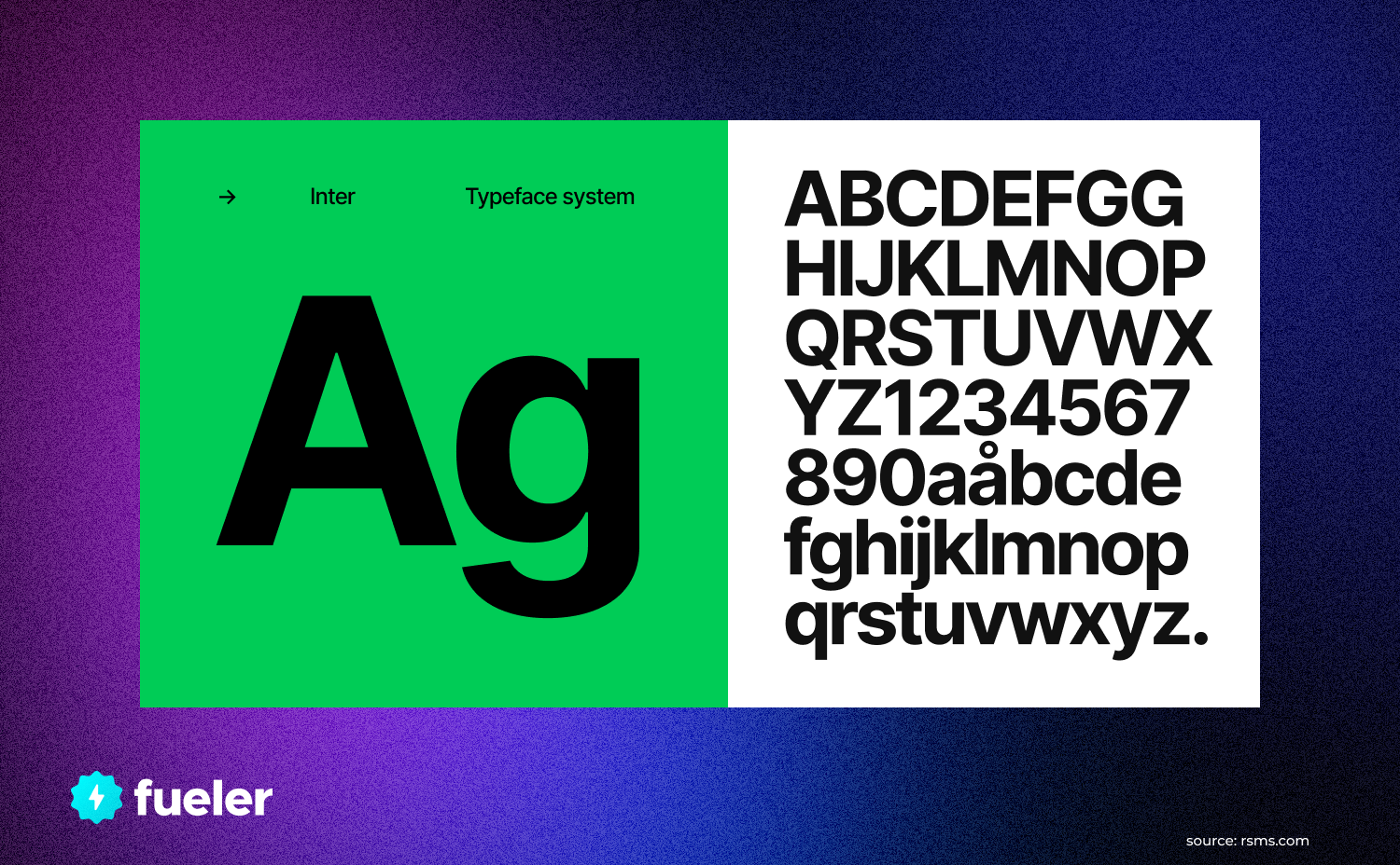
Inter Font
If you're a fan of Helvetica, but you want something more customisable, Inter is the perfect alternative. Unlike Helvetica, Inter comes in a range of weights and widths that allows designers to mix and match styles to perfectly suit the project they're working on.
Inter is an open-source typeface that was created by Rasmus Andersson back in 2011. Rasmus worked with a team of independent designers and developers to bring Inter to life and make it an ever-evolving typeface that can be adapted to suit any design project.
Inter is designed for use on screens, which makes it the go-to choice for web and mobile designers.
Its range of parameters can be easily adjusted, making it incredibly versatile for creating titles, headers or larger text formats. It even comes with special features like small caps, stylistic alternates and fractions!
8. Avenir: Versatile and Elegant
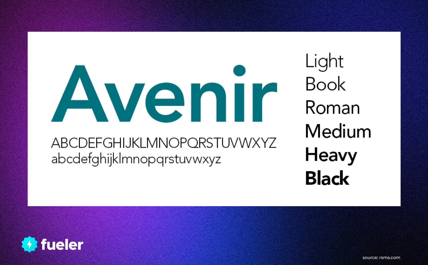
Avenir Font
If you're looking for a font to use in a place where Helvetica just won't do, Avenir might be the perfect alternative. It's versatile, modern, and elegant—and it's been around since 1988.
Avenir is a typeface that was created by designer Adrian Frutiger to be modern yet classic at the same time, and it was based on early geometric sans-serif typefaces from the 1920s.
It has a mix of thick and thin strokes, which can make it suitable for large headlines or small amounts of text.
When using Avenir in your designs, you'll have plenty of choices. The typeface comes in six weights (light to black), each with matching italics.
However, if more character is what you need, there are also alternate versions like Book Oblique and Demi Condensed.
9. Gotham STF: High Contrast With a Human Touch
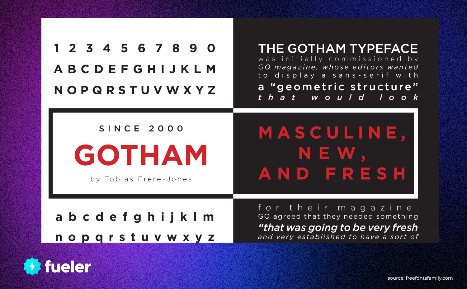
Gotham Font
Gotham STF (Small Type Family) is the perfect solution for when you want an ultra-modern font with an eye-catching style. It’s a high-contrast font with a humanistic touch, making it look both futuristic and modern, yet also comfortable and inviting.
This sans serif font is designed to be used as both a headline and body font, so it’s got plenty of versatility. Its proportions are based on more traditional alternatives like Helvetica, but its sharp edges give it a fresh feel.
Here are some of the features that make Gotham STF such an attractive option:
- Bold outlines and precise curves offer a unique design in comparison to other fonts.
- The capital letters are slightly taller than the lowercase ones and have reduced line spacing for better legibility.
- Gotham STF has multiple weights from light to black. This means that you can use the same typeface for titles, headings, body text, and more without sacrificing any readability or legibility.
10. Neutraface: Inspired by Architecture
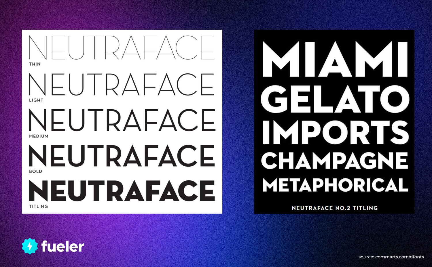
Neutraface
If you are looking for a truly unique typeface that is inspired by architecture, then Neutraface is your best choice.
First designed in 2004 by House Industries, Neutraface was inspired by the modernist architectural designs of famed architect Rudolph Schindler. This font features a balanced design, with an airy, almost futuristic look and feel that makes it perfect for contemporary projects.
The font comes in a variety of weights, including thin, regular and bold, so you can find the right weight for your project.
Neutraface is incredibly versatile, making it suitable for both headline copy and body text. Its versatility also allows it to be used in a variety of media types and applications like websites, posters, billboards and even printed books.
In addition to its distinct design characteristics, Neutraface is extremely legible due to its generous letter spacing which helps improve readability at small sizes.
11. Trade Gothic Next: Art Deco Meets Contemporary Tech
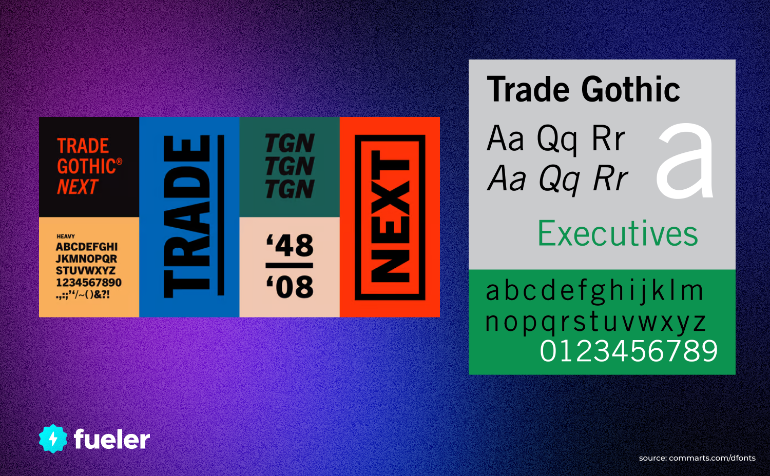
TradeGothic Next
When thinking of a modern font inspired by the Art Deco era, Trade Gothic Next is the obvious choice. It might look old-fashioned but it’s bumping with a sleek, contemporary feel that has been designed to work perfectly on digital devices.
Trade Gothic Next is an extended version of Trade Gothic. It was created in 1968 by American-type designer Jackson Burke and offers a humanistic flavor that works especially well for headlines or subheadings when trying to evoke an Art Deco feel.
One of its standout features is its varied letterforms, giving it extra impact when used for large titles.
This font includes 11 different weights and 6 accompanying width variations specifically for digital use, making Trade Gothic Next very versatile for use in web design and tech projects.
With its mix of classic lines and modern aesthetics, it’s the perfect bridge between vintage style and tech-savvy visuals — ideal for when you need to inject a little of both into your work!
Conclusion
For designers or anyone looking for a good alternative to Helvetica in 2023, the options are numerous and varied. Whether you're looking for something with a modern aesthetic, something with a classic feeling, something with a touch of whimsy, or something a little more versatile, there's a font that has something for everyone.
No matter which font you choose, having options allows you to create the best work possible and express yourself in any way you'd like. If you're looking to stand out from the crowd, choosing one of these fonts instead of Helvetica is the perfect way to do it.